2010/08/23

Born-again Home Buyers

This is hilarious, and a testament to the lack of financial education in the Untied States of America.  (It's no better in my country, Cana-dumb.)  Today I came across the following:


In an annual survey conducted by the economists Robert J. Shiller and Karl E. Case, hundreds of new owners in four communities — Alameda County near San Francisco, Boston, Orange County south of Los Angeles, and Milwaukee — once again said they believed prices would rise about 10 percent a year for the next decade.
With minor swings in sentiment, the latest results reflect what new buyers always seem to feel. At the boom’s peak in 2005, they said prices would go up. When the market was sliding in 2008, they still said prices would go up.
“People think it’s a law of nature,” said Mr. Shiller, who teaches at Yale.


 At least that's an improvement from the survey done in SoCal in 2005 which I referenced in a previous article, wherein the average estimate for increase in house prices for the next 10 years was 20% per year.  And we all know what happened next.


These are definitely born-again house buyers because their estimate has to be based on nothing but faith.  There is no logic in such an estimate based on fundamentals.

There are places for faith in a person's life, but a home purchase is not one.


Faith... Must be enforced by reason...When faith becomes blind it dies.-- Mahatma Gandhi

2010/08/16

Inflation-adjusted Asset Prices

In this post I intend to focus on real asset prices versus nominal prices, as well as the cyclical movements of those prices.

Real prices deal with price changes over a period of time after factoring in inflation.  Nominal prices deal with the numbers only without adjustment for inflation. 

There are cycles in the prices of all assets.  The professionals tend to buy undervalued assets and sell when they are overvalued.  The amateurs do the opposite.  There are far fewer pros than amateurs in every asset market, and the pros engage in asset rotation, never sticking with just one thing, constantly moving their money from high-priced assets to low-priced ones.  The pros also short assets (bet on over-priced assets falling in price) so they make money in both rising and falling markets.

There are many images in this post.  Click on any image to get a sharper view.


Typical Investment Cycle

 Below is a chart of a typical investment cycle.  What is important is that there is usually a long, flat bottom when assets are undervalued and the "smart money" accumulates.  Then there is a gradual run-up in price as buying pressure increases.  Following the gradual rise there is often a parabolic "blow-off" where prices ramp up rapidly and the asset becomes quite over-valued (although the public buying at this point will dispute the over-valuation).  Finally there is the price collapse where the public is encouraged to buy more because the asset "is so much cheaper".  You're not at the bottom until you hear all your friends and neighbours state, "I'll never buy asset X again!"  (But that doesn't stop them from buying overpriced asset Y the next week.)  At this point asset X probably has dropped below the long term price trend line, and is under-valued.   This chart is from Jean-Paul Rodrigue.
Here's another showing the same general cycle, but more from a trader's point of view.

Stock Market Cycles

 Below is a long term chart of the Dow Jones Industrial Average showing both nominal and real prices, ignoring dividends.  "Investment advisors" flogging stocks usually talk about the nominal numbers (blue price line), to exaggerate returns.  Knowledgeable investors always look at real returns after inflation (pale green price line).
In the above chart I have added three horizontal lines.  The green one shows that if you had bought the DJIA at the height of the "roaring 20s" it would have taken you to about 1960 to break even in real prices.  The mauve one shows that if you had bought the high of 1966 it would have taken to about 1996 to break even (my manual calculations in the past showed the break even in 1998).  And the aqua line shows how the 2007 high is at about the same level as the 2000 high in real prices.

Note how the DJIA tried to break above 1000 several times (nominal prices) from 1966, until it finally made it in 1982.  Of course the DJIA at 1000 in 1982 only had 28% (my calculations) of the purchasing power that it had in 1966, so that's why you have to go way up the curve in nominal prices to 1998 to get break even in real terms.

During all of these periods the pros made huge fortunes trading the cycles up and down, while the "buy and holders" on average had meagre returns, since they tended to buy most near the tops of these cycles, and got fooled thinking they were creating wealth simply because the nominal price may have gone up.


Commodities
It is important to understand commodity price trends because the price of commodities feeds into most of the goods that we purchase.  While commodity prices have been in a general decline for a century (see image immediately below), I think this "gravy train" has come to an end due to large world demand increases.  In specific, I think energy costs will drive the real cost of most commodities up (see my post "It's all about Energy"), in turn causing a lowering of lifestyle in the developed nations.

Crude Oil.  
Note the long period of stable, low prices prior to 1973 when much of the North American growth took place; also note how the top of the 1979 price spike wasn't that much smaller than the 2008 one in real terms.  In 1980-1982 we suffered a double dip recession with high unemployment (sound familiar?)  The 1990s was also a period of economic growth with low, relatively stable oil prices.  Oil was at $30/bbl in 2003 before the looting of Iraq began.  Don't hold your breath waiting for it to return to $30.


 Gasoline
Canadians live to complain about two things -- the weather and gasoline prices.  After all, we all know that gasoline prices are unrealistically high and the oil companies are gouging us.  (I don't know that, but most Canadians seem to; I am of the belief that gasoline is one of the greatest bargains ever.)  In the chart below note how the real price (2010 US prices) during the Great Depression, during the 1980-82 double dip recession, and the 2008 run-up all had annual average prices over $3 per gallon.  Also note the all time cheapest real prices during the 1990s. The long term chart indicates that prices should work their way down below $1.50 (2010 dollars) in 3 to 4 years.  Any bets?  It can get there, but we'd be in the "Greater Depression", which is always a possibility.
Gold
The real price trend in red in the below chart indicates turning points in long term asset trends.  We had a hard asset cycle for several years before 1981 when commodities tend to do well and financial assets like stocks and bonds are less profitable.  From 1981 to 2001 financial assets did very well, in a disinflationary declining interest rate environment, and commodities were generally not great investments.  For the last decade, and perhaps for most of the next one we will be in a hard asset cycle again, and stocks will perform poorly.

It is possible, maybe even probable that there will be a parabolic price lift in the price of gold towards the end of this hard asset cycle, like the run-up in 1980.  Many Canadian estates being settled now have gold coins, sometimes bullion as part of the estate.  Many of those deceased persons bought near the top in 1980 and the real price of gold today in the $1200 range is likely still below their purchase price.

In 1982 when I was working at a financial institution my manager came in one day with a hockey bag of gold bullion that he was selling.  Apparently he had accumulated the gold during the 1970s and thought (correctly) that the inflationary cycle was over and there was little potential for further price run-up.  The bag was very heavy, so it probably held about $1 million in gold in today's prices.
Bonds
As interest rates drop bond prices go up.  Note the highest rate of the 30 Year Treasurys was in 1981, at the end of the previous hard asset cycle, and we are currently at very low rates (closed at 3.72% today).  This abnormally low rate is an indicator of economic desperation, not strength.  However, the fall from 1981, in general, resulted in economic growth.

I recall selling a $500,000 5-year income averaging annuity to a client in 1982, yielding 18% interest.  He had just sold some land in Alberta (not bad timing, but 1977-78 would have been better) and was looking for more profitable allocation of his funds.
Copper
This commodity is often referred to as "Dr. Copper" because it appears to have a Ph.D. in economics, as its price movement tends to indicate the direction of the economy.  I don't rate most economists as highly as copper in matters of intelligence, and copper also has the added advantage of being useful to mankind.  Note how the real price of copper reached all time lows in real terms during the 2001-2003 period. 
Corn
Corn is one of the most important agricultural crops, with other grains and soybeans generally moving in the same direction as corn.  Note in the below chart how the real price of corn dropped due to cheap energy and improvements in yield until recent years.  I attribute the recent real price rise to the corn ethanol industry.  So now corn trades partially as an agricultural product, and partially as an energy source (and a damn poor one at that).  Just another irrational farm subsidy, sold to a gullible public as the means to energy independence. 

Housing
This section will have the most charts and discussion because it is the most important asset for most people.  This is where North Americans have ("used to have" in the United Spendthrifts of America) most of their wealth. Some people are very emotional about housing.  Telling them that a primary residence is not, never has been, and never will be a great investment is like telling a Christian fundamentalist that the world is over 6,000 years old.  (That doesn't mean it can't be a good investment under the right circumstances, when done by knowledgeable people seeking rental income, or as a personal dwelling when bought near cycle bottoms.)

There was a time when buying a house was a very important decision.  People saved for several years for a substantial down payment of 20-25%, and then worked hard to pay off the mortgage in 20 years or less.  A house was a place to live, not an investment.  A married couple who bought a house often raised their children there, and retired there, never seeing a need to change (not many realtor fees in that lifestyle choice).

Following the stock market drop in the early 2000s I heard many people say they'll never invest in the stock market again (asset X), but will put their money into something safe that never goes down like real estate (asset Y).  While I laughed at the time, I had no clue how over-valued housing would get, fuelled by low interest rates and minimal or zero down payments.  And of course the governments, banks, home builders, and (my all time favourite housing clip) realtors attempted to push anyone who could fog a mirror into purchasing.

The combined effect was to push the home "ownership" rate up from 64-65% to 69%, as in the chart below.  The same thing happened in Canada. Many of those new "owners" were not financially in a position to take on a mortgage, and will return to renting, taking down others as well.  The "ownership" rate might even drop below 64% as the public finally learns that a house and a retirement plan are two different things.


There was a study done on Amsterdam house prices covering 1628 to 1973 that showed houses there appreciated about 0.2% per year above the rate of inflation.  (That should be good enough for those who say as long as you buy for the long term you will make significant gains in housing.)  0.2% above the rate of inflation is not a desirable investment return.

Robert Shiller referred to the Amsterdam study when he did his historical analysis of American house prices as shown in the chart below.  Shiller found a long term price appreciation of 0.4% above the rate of inflation in the USA.  Note the relatively stable real price of housing from about 1950 to 2000, with prices contained between the 105 and 125 levels.

Here's another chart showing essentially the same information, except it also has nominal prices (blue line).
Below is a chart showing housing prices in the USA, Australia and Japan, with all prices normalized in 1980.  Remember the 1980s when everyone thought Japan was an unstoppable industrialized nation who would soon own much of the property in America; people were learning Japanese, as you recall, to prepare for the future.  After 1990 the Japanese economy went into deflation.  Since then housing prices have moved down due to extreme over-pricing in the 1980s and a banking system that refused to acknowledge its loses.  (Sound familiar?  Show that chart to your realtor buddy who insists prices always go up in the long run.  In the long run we're all dead.)  

Australia is way beyond stupid-high prices, due to three government interventions to blow the housing bubble higher.  Prices are just levelling off, and there will be much pain for the middle class in future years.  The prices in America are getting closer to the long term trend line.  However, America being an empire in decline, I expect prices to overshoot considerably to the downside.

 Below is a comparative chart of US and Canadian house prices, with a normalized starting point of 2000.  Note that US home prices and Canadian prices both doubled 2000 prices, but it took Canadian prices four years longer to get there.  After the prices started to drop in 2008 Harper and Flaherty issued a gazillion hand mirrors to employees at the banks and CMHC.  The directive was something like, "Anyone who can fog this gets a mortgage, capice?"  Then they went on a disinformation campaign telling the entire world how prudent Canadian borrowers and lenders are.  Any guesses what happens next to Canadian prices?

 Let's examine house prices in boom-and-bust Alberta, the only province in Canada to have been officially bankrupt.  The next chart is from the Edmonton Housing Bust blog where there are several good charts and some decent housing price analyses.  The article that this chart comes from is very good, and worth a study.  Note that if you bought in 1977-82 it took you 24-29 years to break even in about 2006 (see mauve line I added).  Chart values are in 2009 dollars.  Note also the author arbitrarily applied a 1.8% growth rate above the real house prices to establish the green trend line; house prices are about $100,000 above this trend line.  But of course "it's different here -- we have oil".  So does Texas where house prices are much cheaper.  Heh!

 Next is a chart of Calgary prices where "radley77" did a similar exercise, and fitted a 1.2% trend line to the real house prices.  I added the mauve line to show it took until 2004 to return to 1977-82 real prices.  Note that extrapolation of the 1.2% growth line shows recent prices to be at least $100,000 above the long term trend.  It seems just like yesterday that Calgarians were defaulting on their mortgages in droves, but it probably was during the 1980s.   You could buy houses in Alberta for $1 then; the catch was that you had to assume the existing mortgage, which many people ultimately found to be a very bad deal.  But "it's different this time!"  Heh!

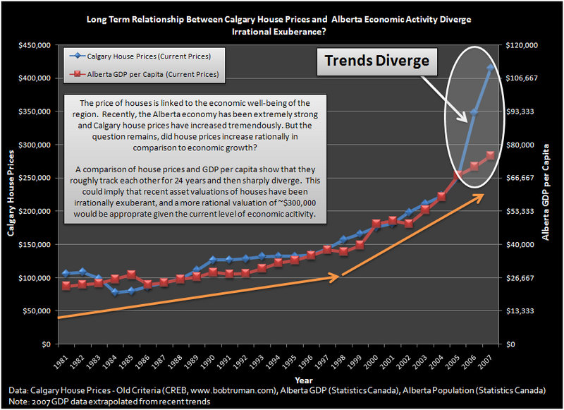
For a different comparison, here's a chart showing Calgary house prices plotted against per capita GDP.  Note how house prices jumped away from per capita GDP in 2006, leading to a gap of about $100,000 in 2007.  Any guesses on how the gap between the two will be closed?

Alberta has had a bit of a price pullback, so Edmonton and Calgary are not as over-valued as Toronto.  And then there's Vancouver.  What can I say, except it is rated as having the most unaffordable housing in the world.


Jobs, Debt
Does anyone other than me see a trend in the labour participation rate of males in the USA?  Gee, what could this mean for the economy and purchasing power of the population?

As interest rates drop, so do savings rates.  When they can't get a decent interest rate on money on deposit, people tend not to save, but invest in risk assets and borrow more.  The below chart shows the drop in savings rate in the USA, which matches up nicely with the 30 year Treasury rate posted above.

 Next is the savings rate for Canada plotted against interest rates.  Do you think banksters might know exactly what they're doing here?  The looting of the middle class continues.  It won't be pretty when interest rates turn up.  Expect massive debt defaults.

Canadians have the highest ratio of debt to income (144%) of the 20 OECD countries, as described in this recent article (May, 2010) and illustrated in the below chart from that article.  After we default on our debts, as many Americans have done, we should once again look more prudent than our American friends and relatives.


The Economist Magazine recently published an article that pegs Canada's housing market at 23% over-valued on a price/rent ratio.  Australia wins the prize at 61%.

 I have previously posted on some real estate transactions that I thought were ill-advised, showing how little Canadians know about housing valuations.  Just when I thought we must surely be out of greater fools, I find there are more.  This article mentions how the Ottawa market is booming, due in part to university students buying condos.  You can't make this stuff up.  

A 22 year-old student has bought a condo under construction, available next spring.  Which just proves her tuition was a total waste of money because she clearly has no critical thought process.  She probably dropped "Inadvisability of Buying Pig in a Poke 101" for "Twitter 303".  And her friends are looking for condos also.  I fear for the future of our country. 

Our American friends must be shaking their heads knowingly.  Sort of like watching a teen horror movie.  "No. Don't go into the attic.  Nothing good will come of it!  Haven't you ever seen this scenario before?" 

Apparently not.

2010/08/04

4 Rat Holes

America is committing financial suicide by pouring money down numerous rat holes.  Before examining four of these destructive money pits, let's look at a chart from Tom Osenton's book, The Death of Demand.  Osenton, as a marketer, recognized that there is a limit to consumer demand, a saturation point.  I believe this saturation point is determined by the excess cheap energy available to an individual or society, which determines ability to buy.

In the below chart, look at the US GDP  by decade.
NOTE:  click any image that follows for a sharper image.
Notice how GDP annual growth rate has dropped from about 4.5% in the 1960s to roughly 2% by 2000.  Osenton wrote his book in 2004, so he didn't have the benefit of seeing the subsequent collapse in demand.  But he predicted it.  I believe GDP has been increasingly exaggerated in the last 20 years due to several instances of changing the methodology of measurement.  I think gross GDP is overstated by about 1%, and inflation is understated by about 1%, which means a stated net GDP of 2% is more likely 0%.  John Williams of shadowstats.com calculates the difference as being much bigger, as shown in the graph on this page.

It is axiomatic that long term corporate revenues should grow at about the same rate as the general economy as measured by GDP.  If corporate profits are soaring (as they currently are) while GDP is not, you must investigate why this is the case.  Otherwise you will entirely miss the mechanics of the looting of America.
The 4 Rat Holes
  1. Large Financial Institutions;
  2. Housing;
  3. Automobile Manufacturers; and,
  4. The US Military.
1. Large Financial Institutions
We are all familiar with the fact that the international Banksters have gambled huge amounts of money, lost much of it, and then were bailed out by taxpayers all over the world.

But people are still gullible enough to believe that those entities are needed.  They aren't.  They subtract economic value and should be eliminated; they are sucking the life out of the economy.  The smaller regional and community banks can do most of what the big ones do, and what they can't do isn't a necessary part of the financial system.  Recent legislation on financial regulation was superficial and did little to diminish the power of the Banksters.

Think of a bank as an auction mart.  Some people have things to sell, some want to buy.  The auctioneer is an intermediary and takes a profit from bringing buyer and seller together at an agreeable price.  Banks should be a small part of the economy because basically all they do is offer services for a fee like a barber.  It is important to understand that the financial sector creates no wealth.  The financial sector merely redistributes existing wealth.  The same can be said of lawyers, accountants, casinos, and many other professions and enterprises.

In recent years the financial sector has been redistributing huge amounts of wealth not from one wealth producer to another, but to themselves.  No economy can survive long term with a parasite this large.

Here's a chart that shows the trend in wealth being stolen by the Banksters (left click for sharper image).
The above graph appeared in Simon Johnson's excellent article showing the power of the financial institutions in our society.

What is tragic is that trillions of dollars have been poured into the financial sector rat hole, and as long as they continue to drain the profits from the economy there cannot be any economic recovery.
_______________________


2. Housing
Americans are finally learning that a house is not an investment -- it is a depreciating asset like a car.  Leave it unattended and over time the price will drop to zero and lower (may have to pay to have it demolished).  Canadians haven't learned that lesson yet, but they are about to.  This isn't to deny that a house won't hold its value relative to inflation over time, provided it is maintained (at a cost of 1-2% of value per year).  In any location with a sound economy that will be the case, but where there is a deteriorating economy house prices will drop.  

Long term, the economies will continue to deteriorate in America and Canada.  Draw your own conclusions about house prices.

Let's examine some housing trends.  First, here is a graphic showing the average size of new homes in America over time.


How does American house size compare to that in other countries?

Note the above chart is in square footage per capita which is a function of both house size and number of occupants. Note also in this mix only two countries have per capita square footage over 500, Denmark and USA.  Canada doesn't appear in this chart, like many other American analyses, because the word hasn't gotten out yet that we are America's largest trading partner and the nation that supplies more oil to America than any other.  The advantage of living next to America is like living on one side of a one-way mirror; we can see them but all they see is their own reflection and often are blissfully unaware of our existance.

Speaking of number of occupants, is there any trend there?  Yes, indeed.  Here's one article that outlines the trend to fewer occupants per house.  And here's another.  Note that the last article states there were 3.1 persons per household in 1970 and 2.6 in 2007.

Let's have some fun with numbers.  If the average house size in 1970 was 1500 square feet (graphic above), and the number of occupants was 3.1, then there were about 484 square feet per occupant.  If we do the same calculation using 2004 house size of 2349 square feet, and 2007 occupancy of 2.6, then that indicates about 903 square feet per occupant, an increase of 87% over the 484 number from 1970.

In the 1960s in the small town where I grew up there were many families with 4 or 5 kids living in 800-1,000 square foot houses.  I was in one of those families with a small house and 5 kids.  It gave us the incentive to get out and provide for ourselves.  But I don't recall ever feeling deprived, harmed, or held back in any way just because we didn't have a bigger house.

Now think about the implications of these trends.  From 1970 to the recent past Americans have bought 87% more house per capita.  And in 1970 there were only 3.1 people in a 1500 square foot home.  What if people decided to share housing more, and go back to the 1970 standard of 484 square feet per person?  What would that mean in terms of houses needed?  Simple math determines that Americans would need only 53.5% of the houses in existance.  Do you think people might share accommodations more as their finances deteriorate?  This is the basis for my oft-repeated statements to my kids to be careful about buying houses -- in North America we have at least twice as much housing as we need.

For those who hold the misconception that housing is a good investment (i.e. provides a return significantly above the risk-free return of T-Bills for instance), below is a graph from a study done by Robert Shiller, appearing in his excellent book Irrational Exuberance.  Note Shiller's chart below has an addition to indicate where American prices should go to get back to historical norms.  Hint -- it's not up.  And with Canadian house prices roughly twice American ones, what do you think might possibly happen to prices here? (Left click on chart to see it in higher definition.  Enlarge by holding down Ctrl key and hitting + key.)

A ten year-old child could draw the red dotted line above, if asked where the line should go if it went to a level where it was at most of the time.  But if the line goes there that would result in yet more massive amounts of underwater mortgages and foreclosures.  (I won't even get into the numbers here because they are available anywhere, everywhere.)  And that would collapse the Banksters who are holding mortgage backed securities at prices far above their market value.  It would also collapse Fannie Mae and Freddie Mac, two supposedly private institutions that are bankrupt, and will have to be bailed by the taxpayers to the tune of hundreds of billions of dollars in any event.  (They are rough equivalents of Canada's government-owned CMHC which will also need a public bailout after young over-leveraged Canadians go bankrupt in droves.)  And it would significantly downgrade the $1.25 trillion in mortgages that the Federal Reserve took onto its balance sheet last year.


How does Canada compare?  Here's a chart from one blogger who indicates the pullback in Canadian house prices could be much less than in the USA, but over several years.  This seems to be the prevailing view of many people whose analyses I respect, and would be consistent with previous housing price slumps.  I may be overly pessimistic on Canadian house prices.  But remember Vancouver is the world's most unaffordable city for housing, according to the last Demographia survey (fall, 2009) with Victoria in #8 spot.  Other Canadian cities in the 100 most unaffordable cities worldwide are Abbotsford, Kelowna, and Toronto.  On the other hand Thunder Bay, Windsor, Moncton, Saguenay and St. John made the list of the 100 most affordable house prices worldwide; the other 95 on the list are all American cities, with Detroit having the most affordable housing in the cities surveyed.  So it's a mixed bag. 


It should be kept in mind that when a trend overshoots significantly, it doesn't just go back to the "normal range" (reversion to the mean).  Most of the time, particularly with financial data or animal population dynamics, the trend overshoots the "normal range" to the downside before settling in the "normal range".

This is one of the hard facts of life that the US Federal Reserve Bank, the US Treasury, and the most useless legislative body on the face of the earth (US Congress) are trying to deny.  They are doing everything in their power to halt the inevitable collapse in house prices.  And they are wasting hundreds of billions of dollars in taxpayer money in that vain attempt.  The latest trial balloon rumour is that The Powers That Be (TPTB) are considering a refinance scheme where mortgages held by Fannie Mae and Freddie Mac could be revised to a 4.5% (or even 4% rate) for a 30 year mortgage.  I can't even begin to describe the numerous ways this is a stupid idea, but it shows how desperate TPTB are getting.

Just more money down another rat hole.

BTW, a housing subsidy like mortgage interest deductibility is just one of the discriminatory, wealth siphoning devices at work.  It not only enhances the wealthier, home "owners" relative to renters, but it enhances the white population relative to the minority groups who tend to be more renters than owners.  That is a form of systemic discrimination.  See graphic below.

And for a bit of housing humour, one blogger noticed that as house sizes increased, so did the size of Americans as indicated by the obesity index (or vice versa).  So, he wondered, do fat people create large houses, or do large houses create fat people?  We all know that carp will grow to fit the size of the pool they are raised in -- are humans similar? (Click for sharper image.)
And of course for the two almost Ph.D.s in the family I do realize correlation does not imply causation, but I'm having too much fun with those who don't understand that.
__________________

3. Automobile Manufacturers
I am one of the people who believe GM and Chrysler should not have been bailed out.  They are incompetent companies in an industry with huge over-capacity, and will be back for more bailouts.  They gambled and lost.  They built large gas guzzlers for the bigger profit margins and neglected the more fuel efficient models.  And GM in particular was really a finance company that happened to make vehicles as a sideline.  

I find it hilarious that a gullible public believe that the Chevy Volt will bring GM back to profitability, and that car will also be their salvation to low cost motoring, while also moving America towards energy independence.  This is truly rainbows, unicorns, and pixie dust stuff.  That's the kind of disinformation that President O'Bomber has been peddling lately.  He's as clueless on the economics of transportation as he is on everything else economic.  He's the same guy who stated America will outgrow its debt by doubling its exports in five years -- a virtual impossibility!  Of course he lost my support long before that when he hired two incompetent Bankster shills, Tim Geithner and Lawrence Summers into key economic positions.

To get a more balanced view on electric cars, you should read this recent Slate article.  I always find it a good policy to ignore mass media news coverage of anything technical, and go to a source knowledgeable in the topic matter, such as this report on electric car batteries linked in the Slate article.  If you do a little research you will quickly conclude that in 10 years electric cars will still be a very small portion of total vehicles sold, and will likely still be uneconomic for purchasers unless subsidized by government which O'Bomber is doing. 

There is considerable "greenwashing" going on by proponents of electric cars.  By driving an electric car you are switching your fuel from gasoline to about half coal and half natural gas (the two biggest sources of electrical power).   The Chevy Volt is a $41,000 car with a $13,000 battery pack installed as well as a small gasoline engine.  And what would a much superior Ford Focus cost?  Hmm.  No wonder the studies show there is no market for this vehicle in the diminishing middle class.  It's something for movie stars and Google engineers to show off their enviro-friendly approach to life.

O'Bomber is funding lithium ion battery manufacturers in the United Subsidies of America because they don't have any.  Why not?  Is there anything in the land of the free and home of the brave that isn't cross-subsidized 19 different ways?  Little wonder American dignitaries are laughed at when they tour the world promoting their brand of "free market" capitalism.  

And the studies show that soon there will be twice as much lithium battery supply as demand, which means inefficient American producers will have to be subsidized to the tune of millions of dollars per job created.  More rat hole money.  But, O'Bomber says, the price will come down.  Of course it will.  It has to because we are in a deflationary credit unwind, and the vehicle is grossly uneconomic with the current price structure.  But other cars will be introduced at lower price as well.  Why wouldn't people consider something like an economical Tata Nano for less than $3,000 for city driving?

Ha! After writing the above, I found the following link -- someone who thinks like me on this topic.  I suspect the Chevy Volt will be roughly equivalent to another Chevrolet product I remember -- the Vega, just another over-hyped piece of junk!  Remember George Bush and Arnold Schwarzenegger hyping (and subsidizing) the hydrogen fuel cell car just a few years back as the transportation solution of the future? O'Bomber discarded that concept  as unrealistic and switched funding to the lithium ion electric car concept.  Government fads and subsidies are changed more often than my underwear.

Now that I got some of the detailed things off my chest, let's look at some big picture info.  Here's a graph of the trend of American vehicles per capita and vehicle miles driven from 1950 through 2007.

Note the trend upward in Vehicles per Capita and Vehicle-Miles per Capita as Americans felt increasingly more wealthy.  What if Americans felt less wealthy and decided to drive less?  Could the uptrend be broken and return to a lower level?  There are a few clues in the graphic below.  Notice how recent sales are back to early 1980s levels.  But they'll rebound, right?  Maybe, but how much?  And is it possible after a rebound sales could drop off again to even lower levels?  Stay tuned.  


Below is a more recent chart, showing sales for the years 2006 through mid-2010.  Notice the artificial spike in sales created by the "Cash for Clunkers" promotion in 2009 (yet more tax dollars down a rat hole).


I tell people (as they stare at me as though I need to be institutionalized with heavy sedation and psychiatric help at all times) that 2006-2007 was probably the highest gasoline consumption America will ever see, and also had the most cars on the road that we will ever see.  People will car pool more to ease expenses, and cut back on unnecessary driving.  Many fewer cars will be needed, perhaps half as many, just like houses.  Teenagers had better choose their parents carefully, because middle class parents will not be able to spring for a car for a teenager -- they will be struggling to finance a single family vehicle (less so if they get something like a Tata Nano).


And yet all across America they are still planning on building more freeways, airports, etc., despite the overwhelming evidence that there will be neither the funds nor the need for such frivolity.  In the future there will be fewer vehicles on the road, fewer planes in the sky, and speed limits will be reduced to conserve fuel.  There will be more bicycle lanes in the cities.  Many paved roads will revert to gravel surface.


It seems inevitable that there will be many more plant closings in the North American auto sector.  Yet Canadians and Americans seem determined to pour funds into failed manufacturers, to "save the jobs and local economies".  Take a good look at Detroit, folks.  That's the future of the losers in the car manufacturing game.  


When you subsidize GM or Chrysler or a new lithium battery manufacturer you are just pouring taxpayer money down rat holes.  They are uneconomic for many reasons, not just temporarily, but permanently.
_______________________________


4. The American Military
How can this immense bureaucracy with its corruption and incompetence not be higher on the list?  It possibly should have been #3 instead of Automotive.


Where to start?  Let's look at a graph of military spending around the world.


Let's look at a graph of American military spending alone.


If I recall correctly Commander-in-Chief O'Bomber increased the American military budget by 6% last year.  Must be to cover that $400/gallon gasoline that they're burning in Afghanistan hunting down the 50-100 Al Qaeda who are there. That's what it costs to fight a war in far off places.  Of course the military assure us there are literally hundreds of Al Qaeda in Pakistan, so they will need much more money to get them.  But there are also thousands of Taliban insurgents who are unhappy with the infidel invaders, and as a result, tend to kill or injure them whenever possible.  


Afghanistan is where arrogant empires go to learn humility, just prior to losing empire status.


The hunt for terrorists was never really a serious one.  That became apparent early in the Afghanistan invasion when Bin Laden was in the Tora Bora area with his small band of Al Qaeda.  The American commanders in Afghanistan requested 600 Rangers so they could seal off the escape routes to Pakistan, and then gradually tighten the noose until they had killed or captured all the Al Qaeda and insurgent Taliban.  They were refused.  That's when I knew the invasion of Afghanistan was about something else.  The Americans built permanent bases, just like in Iraq and many other countries; they have no intention of leaving, just pulling troops off the street policing duties.  The clandestine search and destroy missions will still go on, but the overt military actions will be wound down.


The war in Afghanistan isn't going nearly as well as portrayed in the mass media.  If you read the relevant blogs regularly you find a picture of waste, incompetence, corruption, and slaughter of innocents -- just like most wars.  Photo sites like this one give a small insight into the reality of a war theatre.  Canada's Prime Minister is a control freak and his administration has manipulated almost all media releases of any significance.  Most attacks on Canadian troops in Afghanistan are not reported because the media are directed not to report them.  Quite frankly, NATO is taking a royal butt kicking in Afghanistan and everyone seems to know it except the public in North America, who somehow think we are "winning the war on terror".


Here's an example of incompetence where Blackwater pilots splat a plane into a box canyon, killing 6, because they had no clue of where they were going and were more interested in what music they wanted to play.  


Gee, do you think there could be a little corruption here where Afghanis are buying villas in Dubai?


And perhaps here as well, where so much reconstruction money for Iraq is not accounted for.  Well, it's only 96% not accounted for, not like it's all missing.


Here's an animated graphic of IED explosions in Afghanistan.  Green dots are no injury, yellow are injuries, red are deaths.  The table with yellow numbers has NATO & civilians on the left and insurgents on the right.  


The most interesting thing about American military involvement in Iraq and Afghanistan is that the majority of the world are secretly in favour.  They won't say this publicly, but if the American military is tied up there, then there is less chance of them invading some other nation.  And most nations want to see a weaker America.  The militant Islamists are overjoyed.  Targets delivered to their own back yards; kill an infidel and never leave the farm.

China and Russia are tickled pink.  Particularly Russia who was driven out of Afghanistan primarily due to American aid to the Afghan "freedom fighters" (now called terrorists or insurgents).  The handheld surface to air missiles were particularly effective in knocking down Russian helicopters; so far Russia hasn't returned the favour by arming the Taliban with such weapons.


After the USSR disintegrated there was agreement that NATO would not expand eastward.  But America convinced a naive Poland to host American missiles, right on Russia's doorstep so to speak.  And America worked on producing "colour revolutions" in many of the USSR break-away countries, so they could set up military bases there.  Georgia is a good example with its American puppet government, American and Israeli troops using Georgia as a military base from which they could easily attack Iran.  So Russia is a little PO'd about the whole American military expansion and would like to see them bleed out more in the mideast.


The same goes for China.  The day will come when China and America square off, and China prefers America to be much weaker militarily when that day comes.  So every day America spends bleeding out its economy brings China closer to being able to take on an American military challenge.  China doesn't need to win the battles; they just need to win the war as the Viet Cong did.  One of their generals stated they would declare full out nuclear war if America interfered with Taiwan or attacked China in any way, and that was in 2005.  They're five years stronger now, and America is five years weaker.  But the Chinese are patient; their best strategy is to wait for America to destroy itself from within.  Remember where Sun Tzu came from.


Sadly, Americans don't realize that much of what their military does is indiscriminantly throw taxpayer money down a rat hole, and create enemies in the process. 

__________________


It's silly season in Washington (when isn't it?) as everyone is preparing for the November mid-term elections.  The minute the results are in, then the parties will begin strategizing for the 2012 elections, including the Presidential election.


Don't expect America to do anything logical or substantial to improve its financial standing before November, and probably very little thereafter.  No American politician is likely to tell the populace the truth as the recently elected Prime Minister of Great Britain has.  America is not paying its way in the world and is headed for massive default.  To avoid this, taxes must rise (on almost everything, everywhere) and government spending must be cut back.  

Americans will either make the decisions themselves, or austerity will be imposed by external forces.  This will be very painful for Americans to accept and the tendency will be to look for someone to blame.  So far it's been mostly political factions blaming each other, with copious amounts of blame directed at China.  But when economic conditions worsen there is always a tendency to go to war (more war in this case).


At some point the bond vigilantes will step in and force America to slow down on debt issuance.  But I think that the commodity vigilantes are more important and more effective.  If America refuses to enact fiscal and monetary responsibility the world outside America will bid up the price of commodities quoted in American dollars.  Every time those prices rise the American economy will get knocked flatter than pee on a plate.  See my previous post, It's all about Energy.


There is one thing I am certain on.  If America doesn't stop throwing money down the four rat holes discussed above, there is zero chance of their economy improving.